Blog / Graphic design
Large-format map design: legends and readability
Large-format map design: source data, symbols, legends, scale and readability checks before sign production.
Large-format map design starts with what people need to find on site. Establish the area, current data and installation location. Enlarging a small map is insufficient if labels, symbols and the legend do not work at the intended viewing distance.
Source data and map coverage
Supply a base map, location list, names and area boundaries. Identify the data source and reviewer. Flag anything that needs checking. A sign must represent the actual area, so verify the data before final layout begins.
Legend and symbol hierarchy
Distinguish primary routes and destinations from supporting information. Each symbol should have one meaning that matches the legend. Use shape and contrast as well as colour. Too many equally prominent markers make individual places harder to find.
Scale checks and production handover
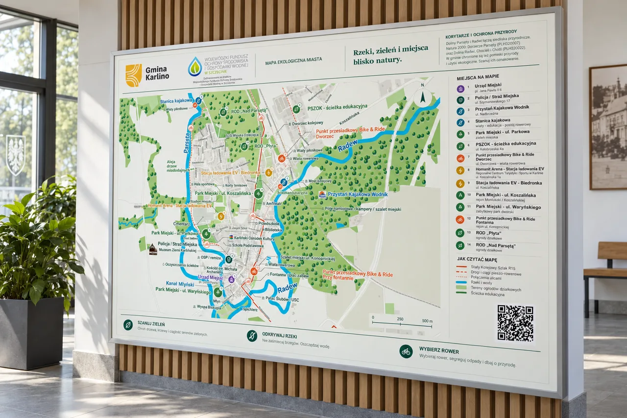
Print a sample section at final size and assess the smallest labels. Consider lighting, sign dimensions and installation. The Gmina Karlino map project illustrates large-format information design. Its mockup shows presentation; production needs separate arrangements.
Project checklist
- Verify place names and symbol-to-legend consistency.
- Assess a sample section from the intended reading distance.
- Check sign dimensions and areas hidden by fittings.
Questions and answers
Who approves names and locations?
The client’s designated data owner. A designer organises the layout but should not resolve unverified geographical information independently.
See what the finished project looks like
Related articles
Graphic design
Banner design: copy and readability
Design a readable banner with a clear message, hierarchy, contrast, suitable formats and print or digital checks.
27 August 20262 min readRead article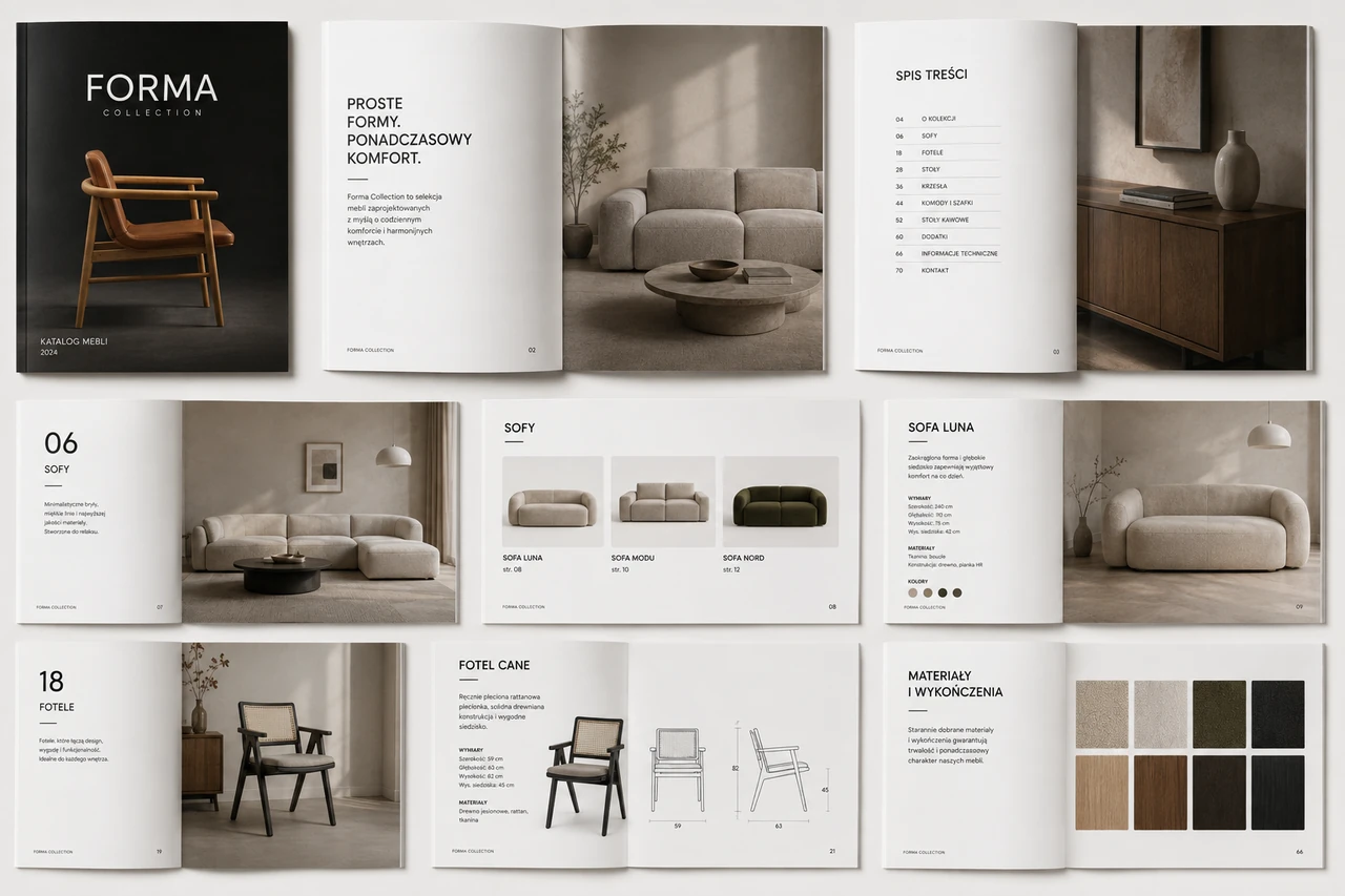
Graphic design
Catalogue design and layout: from content to publication
Catalogue design and layout: structure, covers, tables, source files and revisions, with product catalogue and EM-MED examples.
27 August 20262 min readRead article
Turn your idea into a project.
Choose your services and see the price, or tell us about your project.