Blog / Graphic design
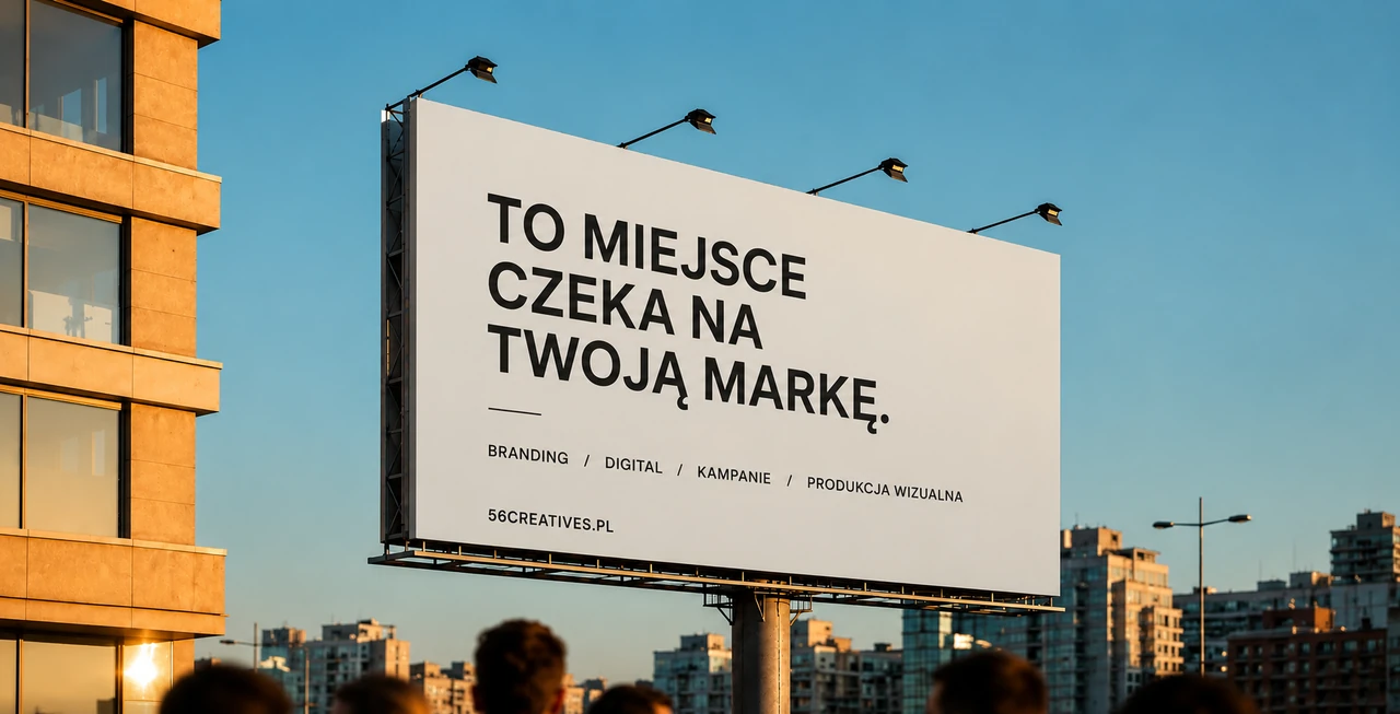
Banner design: copy and readability
Design a readable banner with a clear message, hierarchy, contrast, suitable formats and print or digital checks.
A banner should make the offer and next step easy to identify. Someone passing a roadside sign has different viewing conditions from a website visitor. Establish placement, viewing distance and purpose before deciding how much copy the layout can hold.
One main message
Choose what viewers should remember: a service, product or event. Give the brand, headline and contact different levels of prominence. If everything is large, the reading order becomes unclear. Detailed information can follow on the destination page.
Images, contrast and typography
Imagery should support the message and leave room for text. Check contrast across the background rather than one convenient area. Decorative type may suit a headline, while small details need clarity. Assess the design at a scale and in conditions resembling its placement.
Adaptations and final files
Review cropping and element order for each aspect ratio. Print work must follow supplier requirements; digital ads need confirmed dimensions and file limits. Good composition alone does not determine campaign performance, which also depends on the offer, audience and placement.
Project checklist
- Read the headline at the expected distance and scale.
- Check that imagery does not obscure contact details.
- Review every adaptation, not only the largest design.
Questions and answers
How much copy belongs on a banner?
Only what can be read under the expected conditions. Rather than a universal character limit, test the message, name and next step in a sample layout.
Related articles
Graphic design
How much does banner design cost?
Banner design prices: print or digital, original artwork, adaptations and formats. Review scope and production requirements.
25 August 20262 min readRead article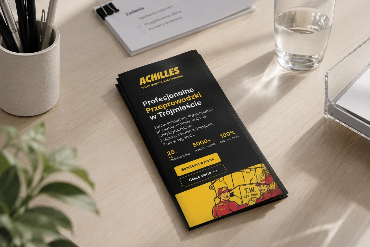
Graphic design
How much does leaflet design cost?
Leaflet design prices: single or double-sided formats, folds, client assets and print files. Compare scope and extra work.
25 August 20262 min readRead article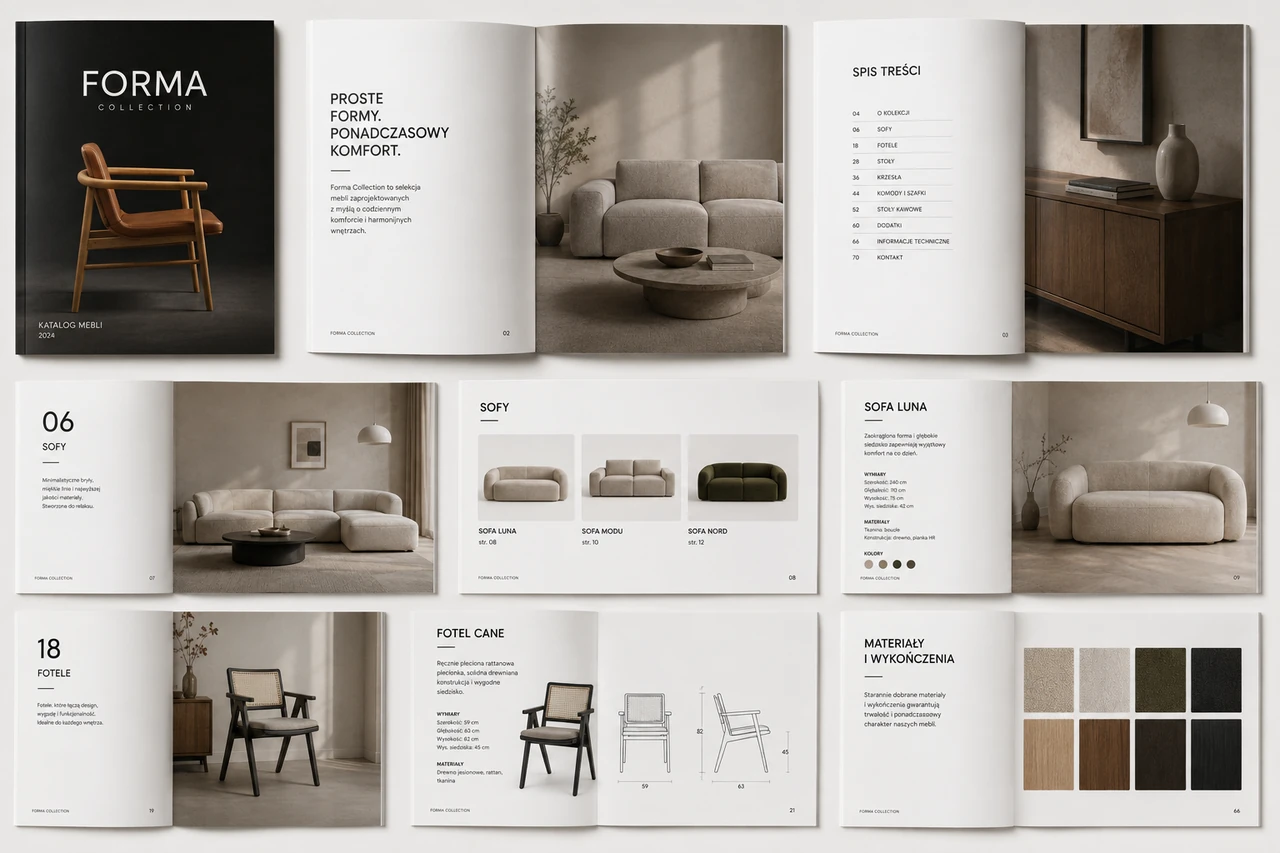
Graphic design
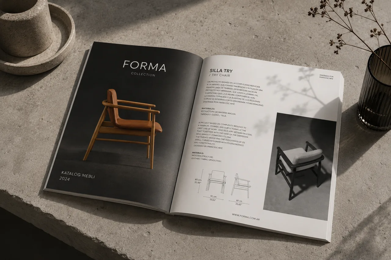
How much does product catalogue design cost?
Catalogue design prices: page count, cover, layout and deliverables. Compare package scope and the materials needed for a quote.
23 August 20262 min readRead article
Turn your idea into a project.
Choose your services and see the price, or tell us about your project.