Blog / Websites
Online store design: from categories to checkout
Design an online store’s categories, search, product pages and checkout, then test ordering on mobile.
Online store design should help people find products, evaluate their features and place an order. Appearance is part of that journey. Build the structure around real inventory and product selection rather than a blank template with sample names.
Categories and search
Category names should match how people search, while filters reflect decision-making features. Test products in several categories and searches with no results. Empty states should offer a next step. On mobile, filters should not obscure comparison information.
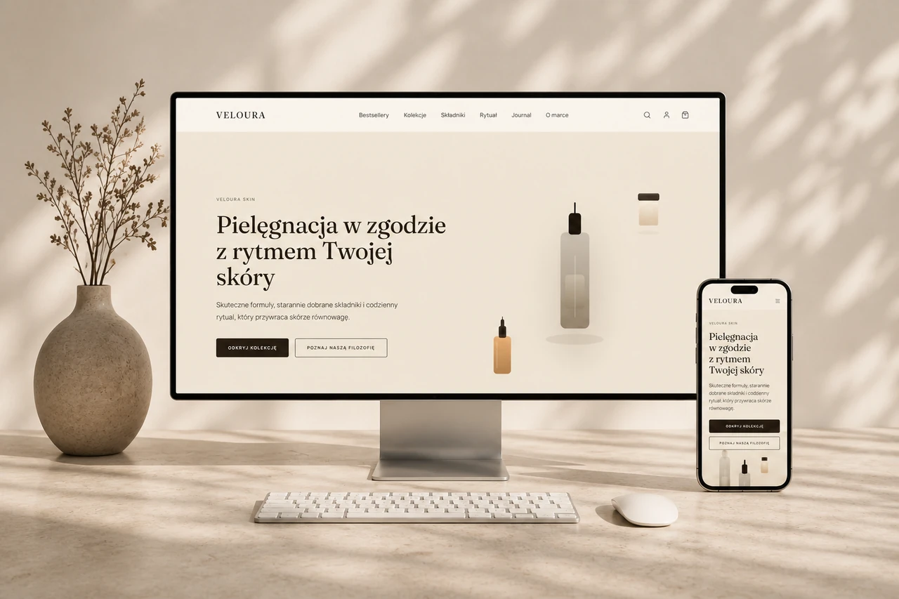
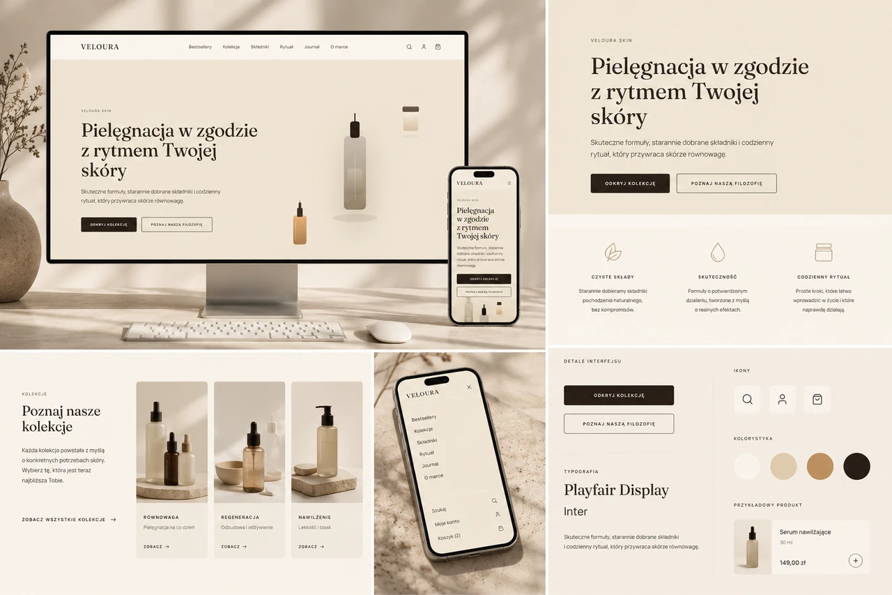
Product pages and variants
Show accurate images, price, availability, variants and delivery information. Details must remain consistent after a variant change. Copy should explain differences relevant to the purchase. Photographs help assess appearance but do not replace dimensions and specifications.
Basket and checkout
Before confirmation, show products, quantities, delivery and total costs. Test basket changes, form errors and payment returns. Customers should understand what happened and how to continue. Preserve entered information when a recoverable error occurs.
How should the live design be assessed?
Place test orders in the appropriate test mode on desktop and mobile. Check messages and order details. Later, assess journey stages and user reports. Design does not guarantee sales; traffic, price and the offer’s terms matter too.
Project checklist
- Find a product without knowing its exact name.
- Change a variant and check its image, price and availability.
- Test unsuccessful and successful ordering in test mode.
Questions and answers
Should checkout always use as few fields as possible?
Remove unnecessary fields but retain those needed to fulfil the order. Clear labels and error handling also matter.
See what the finished project looks like
Related articles
Websites
How much does an online store cost?
Online store prices: product counts, variants, data, payments, delivery and development scope. Learn what to prepare.
25 August 20262 min readRead article
Websites
How much does website design and development cost?
Website prices: landing pages, business sites, sections, pages, client assets and additional costs.
25 August 20262 min readRead article
Websites
Website design: stages of the project
Website design stages: brief, content, UX/UI, development, testing and handover. Clarify client responsibilities and running costs.
9 September 20262 min readRead article
Turn your idea into a project.
Choose your services and see the price, or tell us about your project.