Blog / Branding
Logo on a business card: layout, contrast and files
Logo placement, contact details, colour versions and vectorisation, with business card examples from Marszałek Recykling and JW-CLEAN.
A logo on a business card must remain legible at a small size and leave room for contact details. Begin with the approved mark and final information. A named person’s card may need a different layout from a general company contact card.
How should the logo sit alongside contact details?
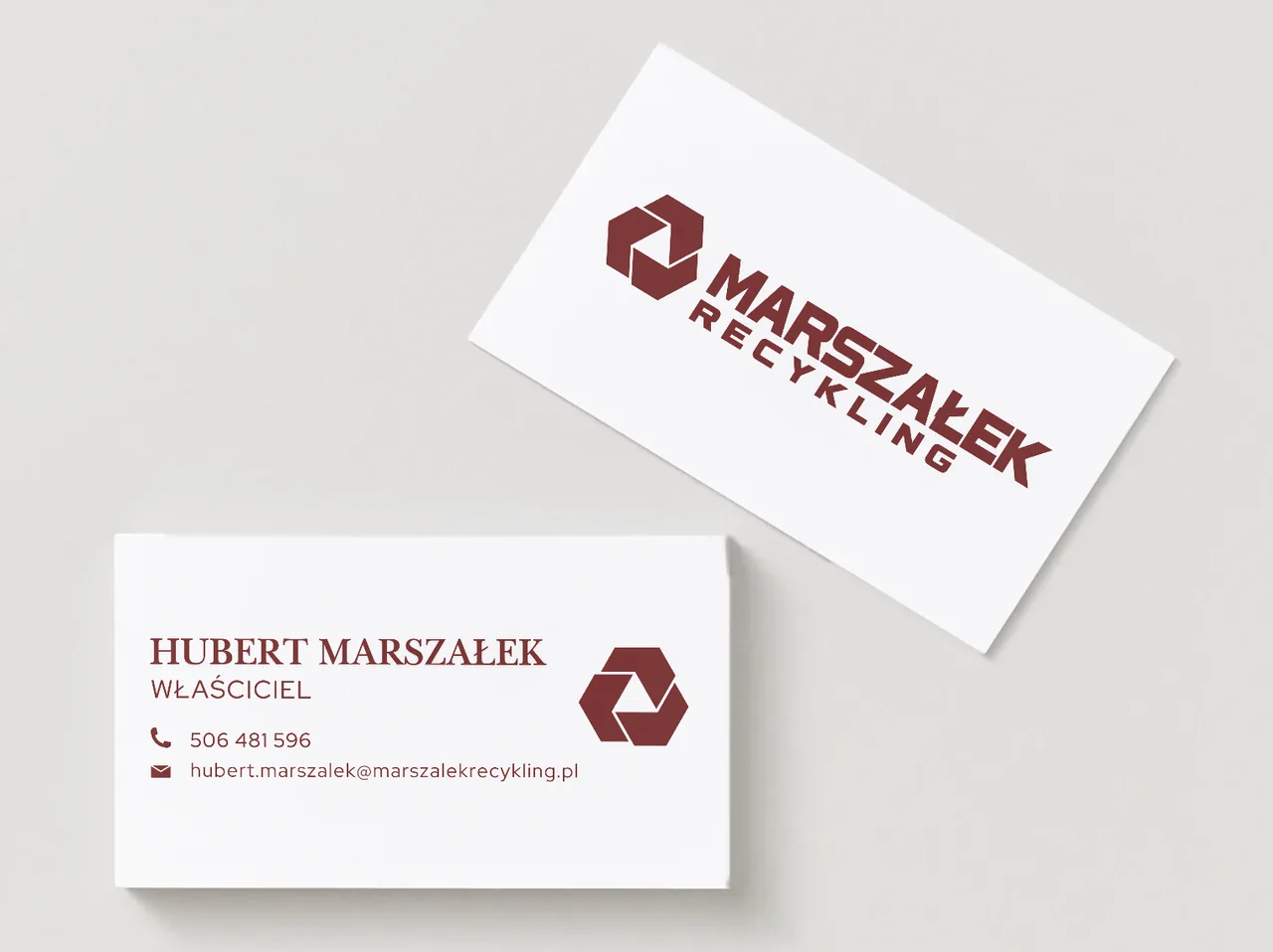
Set a reading order: brand or person, role, then contact. Leave clear space around the mark. If small lettering becomes unreadable, use an approved simplified version. The Marszałek Recykling project explores a geometric mark on light and dark business cards.
Vectorisation and consistency with a leaflet
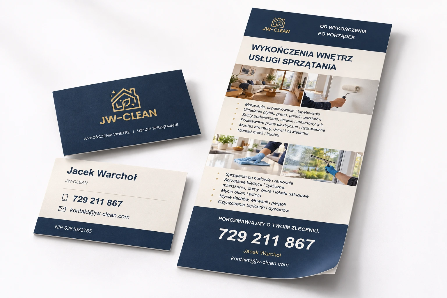
A small JPG may not suit every application. Vectorisation produces a scalable version of an existing mark and differs from a new logo design. For JW-CLEAN, we combined this work with a double-sided card and leaflet. The materials share visual rules but serve different purposes: contact and explaining the offer.
What should be checked before printing?
Review the card at its actual size. Verify the number, email, spelling, contrast and safe distance from the edges. Confirm file format, bleed and other production requirements with the printer. Check both sides again after export, including their orientation.
Project checklist
- Check the smallest text on an actual-size print.
- Compare contact details across the card, leaflet and website.
- Test the QR code if the design includes one.
Preparing bleed: Adobe Illustrator documentation.
Questions and answers
Can a QR code replace contact details?
It can make saving a contact or opening a website easier, but keep an essential contact method readable as text too.
See what the finished project looks like
Related articles
Branding
Logo and visual identity: defining the scope
How does a logo differ from a visual identity? Understand the mark, colours, typography, guidelines and working files.
27 September 20262 min readRead article
Graphic design
Logo design: from brief to final files
How is a logo designed? Brief, visual direction, typography, small-size tests, variants and file handover.
9 September 20262 min readRead article
Turn your idea into a project.
Choose your services and see the price, or tell us about your project.